The reports your leadership team actually opens.
Exec Report, Business Reviews, Trends, and At-Risk — built so every leadership readout takes one click, not a working session. For CEOs, CFOs, and Heads of Department at 50–200 person companies.
Four reports leadership actually uses
Leadership reports fail in three ways.
Most teams produce more reports than their leaders read. The pattern is the same in every org we've seen.
Assembled by hand, every time
An ops manager spends half a day each month stitching numbers from five teams into a deck. By the time it's ready, the data is stale — and the next month, the same person does the same job again.
Wrong format for the audience
Operators give leadership 40 slides of detail. Leadership wants 4 bullets and a status color. Both walk away frustrated — one feels unheard, the other feels under-informed.
The question moved on already
Reports get produced on a cadence — weekly, monthly, quarterly. The question that mattered when the cycle started isn't the question that matters now. Static reports answer the wrong question, late.
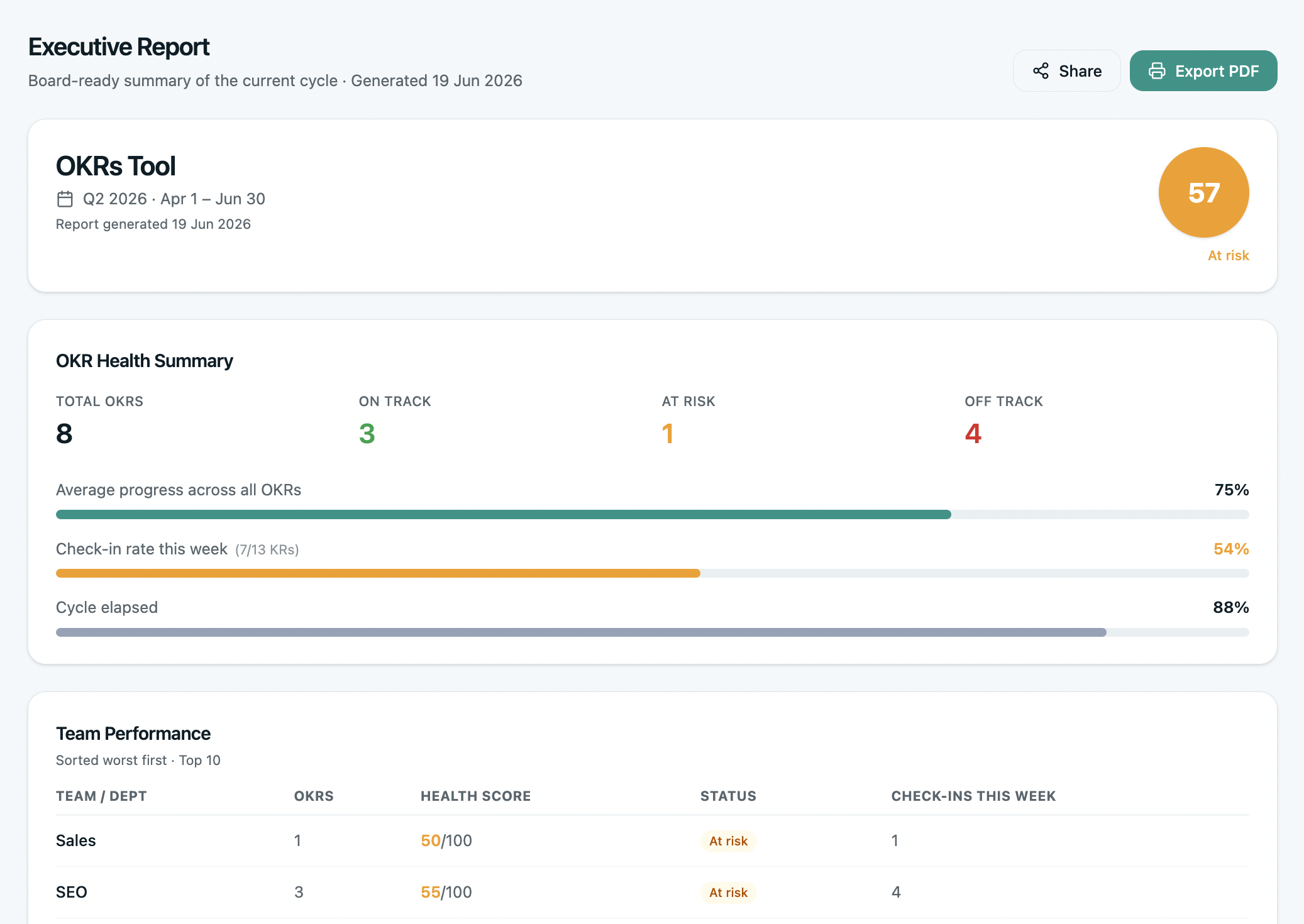
The Exec Report
One click. The whole company's OKR status, ready for leadership. Auto-generated, auto-updated, formatted for executives who need the picture in 90 seconds — not the detail.
Status bars for every company OKR. The top 3 at-risk KRs with the owner's name. The completion forecast. The exec walks in already aligned — the meeting becomes about decisions, not data.
- One-click generation — no working session, no slide deck
- Always live — opens to today's data, not last week's snapshot
- Shareable as a read-only link for non-users (boards, investors)
- Custom commentary section — add context for what the numbers don't show
- PDF export when leadership wants a static artifact
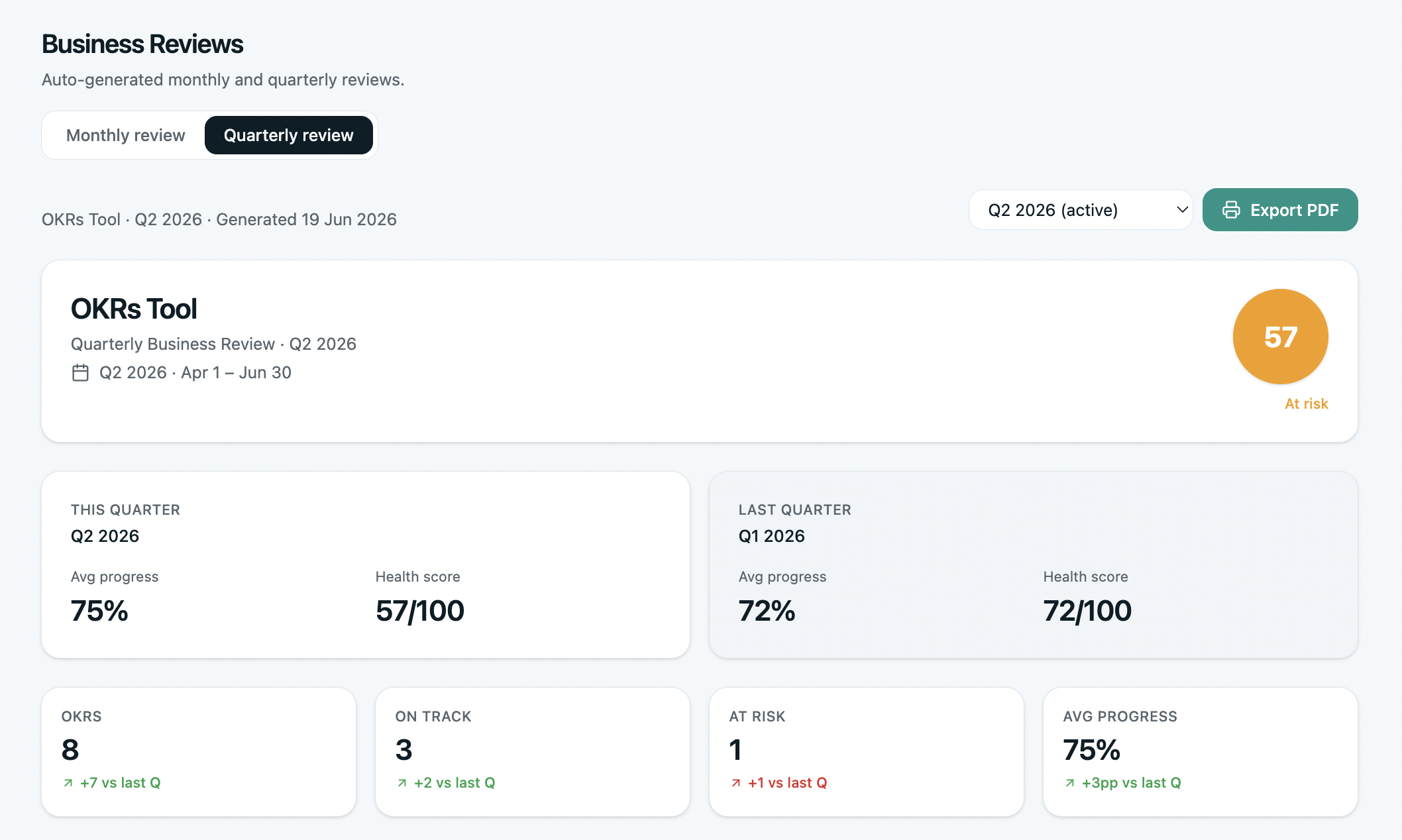
Business Reviews
Monthly and quarterly business reviews built into the product. Not a slide deck someone has to assemble — a live view that opens to the right page when the meeting starts.
Each team's progress against their OKRs. What shipped this month. What slipped. What changed in the forecast. The data is already there — the meeting time gets spent on decisions, not status reports.
- MBR for mid-cycle course correction — what's progressing, what's slipping, what needs to change before cycle ends
- QBR for end-of-cycle learning — final scores, committed vs delivered, what changes for next cycle
- Auto-pulls team check-ins, KR progress, blockers
- Compare against last review — what got better, what got worse
- Action items captured in-product, assigned to owners with due dates
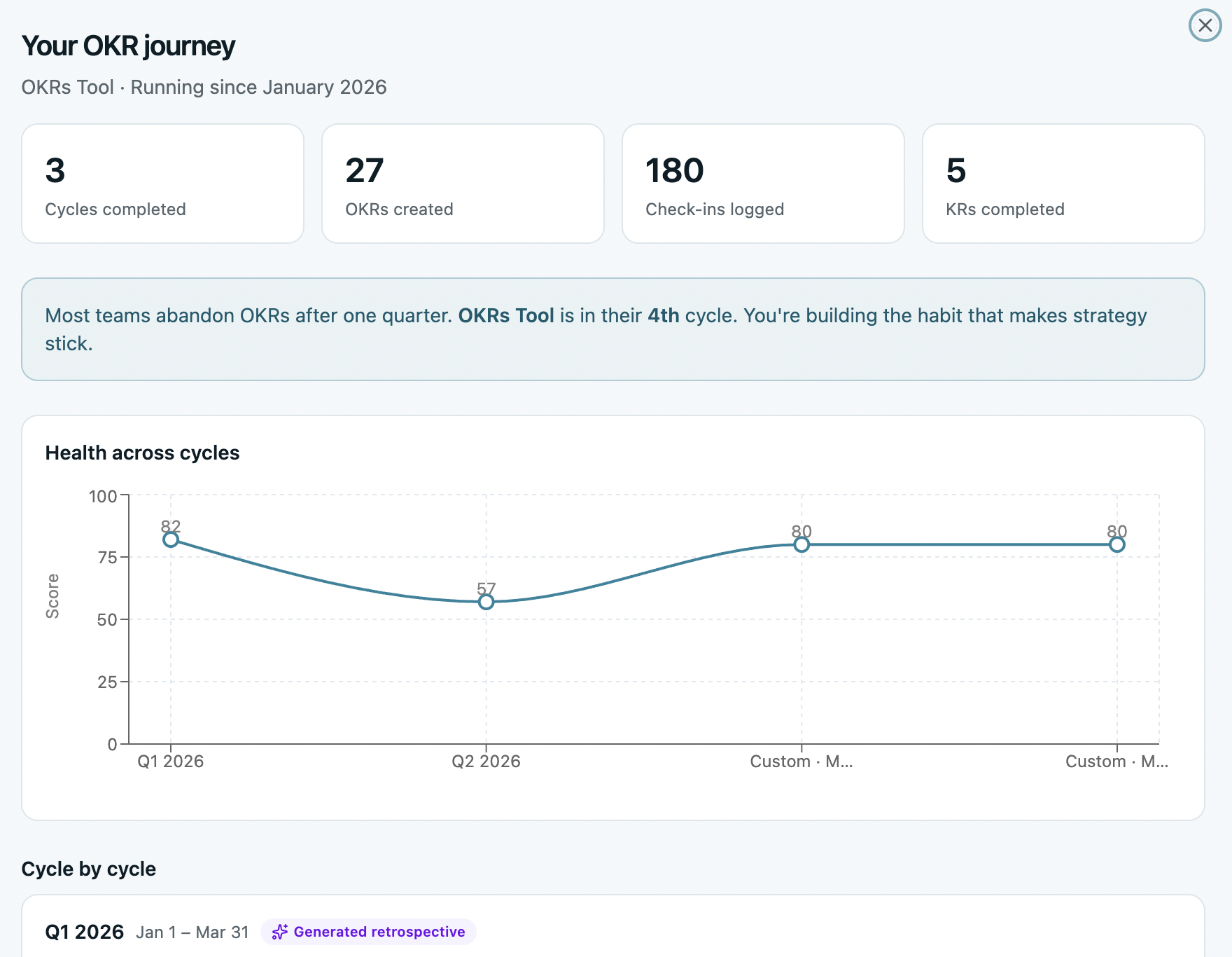
Your OKR Journey
Cycle-over-cycle health trends for your org. See whether your team is getting better, the same, or worse across cycles 1, 2, 3, and beyond — not the industry, not the benchmark, you.
The data behind the 51% → 79% completion compounding pattern from our benchmark, applied to your own organization. The single most important question after a cycle: is this getting healthier or unhealthier?
- Tracks completion rate, check-in cadence, ownership clarity, alignment depth per cycle
- Compares your trajectory against the OKRs Tool benchmark (200+ orgs)
- Surfaces specific cycle-over-cycle regressions and improvements
- Useful in board reviews — “we're on the compounding curve” beats anecdotes
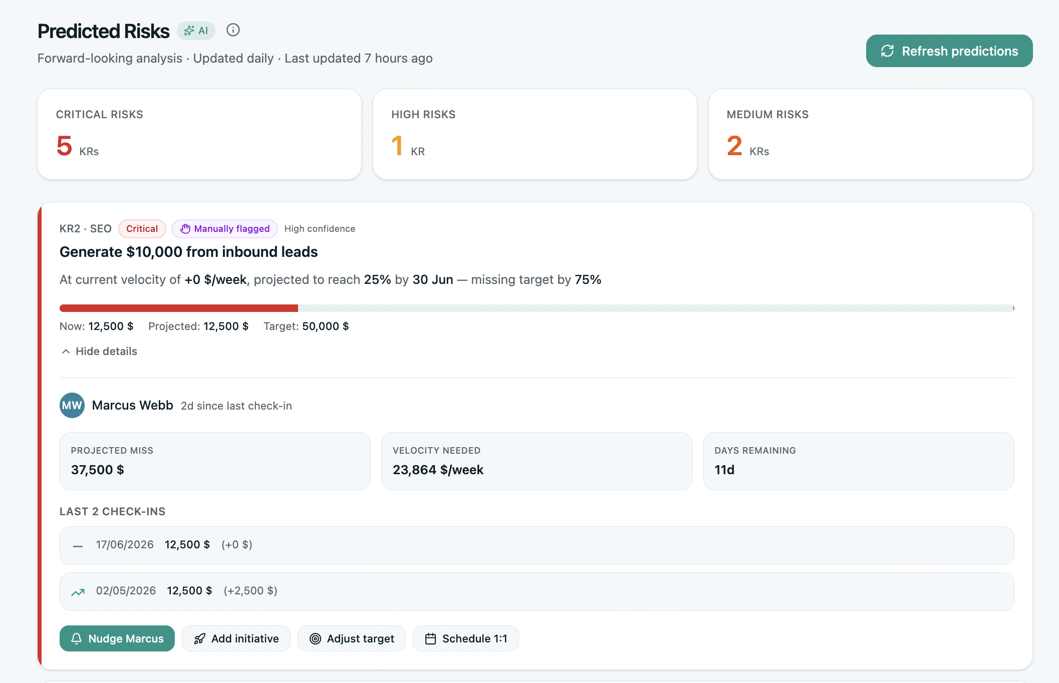
At-Risk predictions
Every KR gets continuously evaluated for risk. Not at the end of the cycle, not in the weekly digest — live, as new check-ins land. The OKRs that are heading off track get flagged before they miss, with the reason why.
The dashboard shows the top at-risk KRs across the org, with the owner's name, the velocity trend, and the predicted finish. Leadership knows what to dig into — without reading every check-in.
- Continuous evaluation — not a weekly snapshot
- Predicted finish based on actual velocity, not linear extrapolation
- Top at-risk KRs ranked by impact — focus on what matters
- Reason hypothesis: stagnant velocity, missed check-ins, blocker patterns
- One-click drill into the underlying KR and owner
The view no one else ships.
A 2×2 quadrant of every OKR by progress and momentum — built into Reports so leadership can see the whole org at a glance.
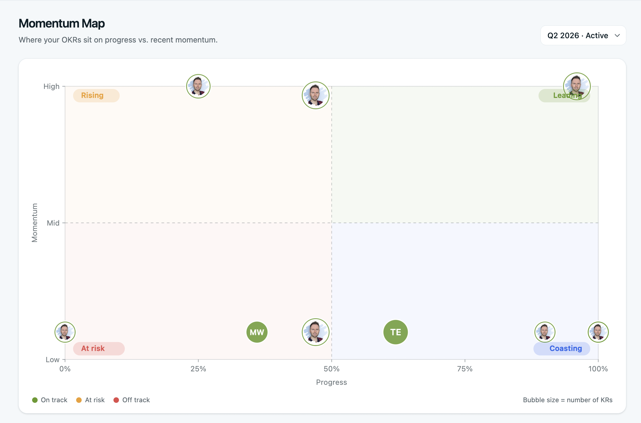
The Momentum Map
Every OKR plotted across progress and momentum on a single chart. Four named zones — Leading, Rising, Coasting, At Risk — tell you where to focus, who needs support, and what's quietly slipping.
A spatial view of leadership reporting. Where the Exec Report tells you the numbers, the Momentum Map shows you the shape — which work is gaining velocity, which is losing it, and which is sitting in the danger zone.
- 4-quadrant view: progress × momentum
- Click any OKR to drill into the underlying KRs
- Filter by team, owner, or cycle
- Pairs naturally with the Exec Report — shape + numbers
OKRs Tool helped us create a much stronger connection between strategy, execution, and measurable outcomes. What previously lived across different platforms is now centralized and gives leadership a consistent view of priorities and progress.

Reports questions, answered.
Four questions ops leaders ask before rolling reports out to leadership.
Can I share reports with my board or investors?
Do reports update live or are they snapshots?
Can I customize what's in the Exec Report?
What's the difference between MBR and QBR?
Reports is one of five sections.
Each is included on every plan. Click any to see the views inside.