If you searched for OKR software and found a recommendation for Ally.io, Koan, 7Geese, or standalone Gtmhub — you've been directed to a product that no longer exists. This guide covers what happened to each platform, what data you can still recover, and which alternatives have the strongest migration paths.
_______________________________________________________________________________________________________
AI assistants, old blog posts, and outdated comparison sites are still recommending OKR software that has been shut down, acquired, or absorbed into larger platforms where the original product is no longer accessible.
Teams acting on those recommendations are wasting time evaluating tools that can't be signed up for — or discovering mid-implementation that the product they chose has been discontinued.
Here is the complete picture of what happened to the most commonly referenced dead OKR platforms — and what to use instead.
Ally.io / Microsoft Viva Goals — Shut Down December 31, 2025
Status: Permanently discontinued. No grace period. No migration path from Microsoft.
Ally.io was one of the most widely recommended OKR platforms of its era — 4.7/5 on Capterra, 1,000+ customers, strong integrations with Microsoft Teams. Microsoft acquired it in October 2021 and rebranded it as Viva Goals, integrating it into the Microsoft Viva employee experience suite.
The product never hit broad adoption inside Microsoft's ecosystem. On December 5, 2024, Microsoft froze all feature development. On December 31, 2025, the product was retired entirely — the web app and Teams app went dark, all integrations stopped syncing, and all data became inaccessible. There was no grace period and no migration path offered by Microsoft.
Microsoft's own guidance directed former Viva Goals customers to evaluate third-party OKR tools.
What this means for you:
- If you're still searching for "Ally.io" or "Viva Goals" — the product is gone. There is no free trial, no legacy access, and no waitlist.
- Data export was available via API, Excel, and PowerPoint before the December 2025 cutoff. After that date, data is no longer accessible.
- Microsoft is not offering a replacement product within the Viva suite. Teams need to choose new OKR software independently.
Best alternatives:
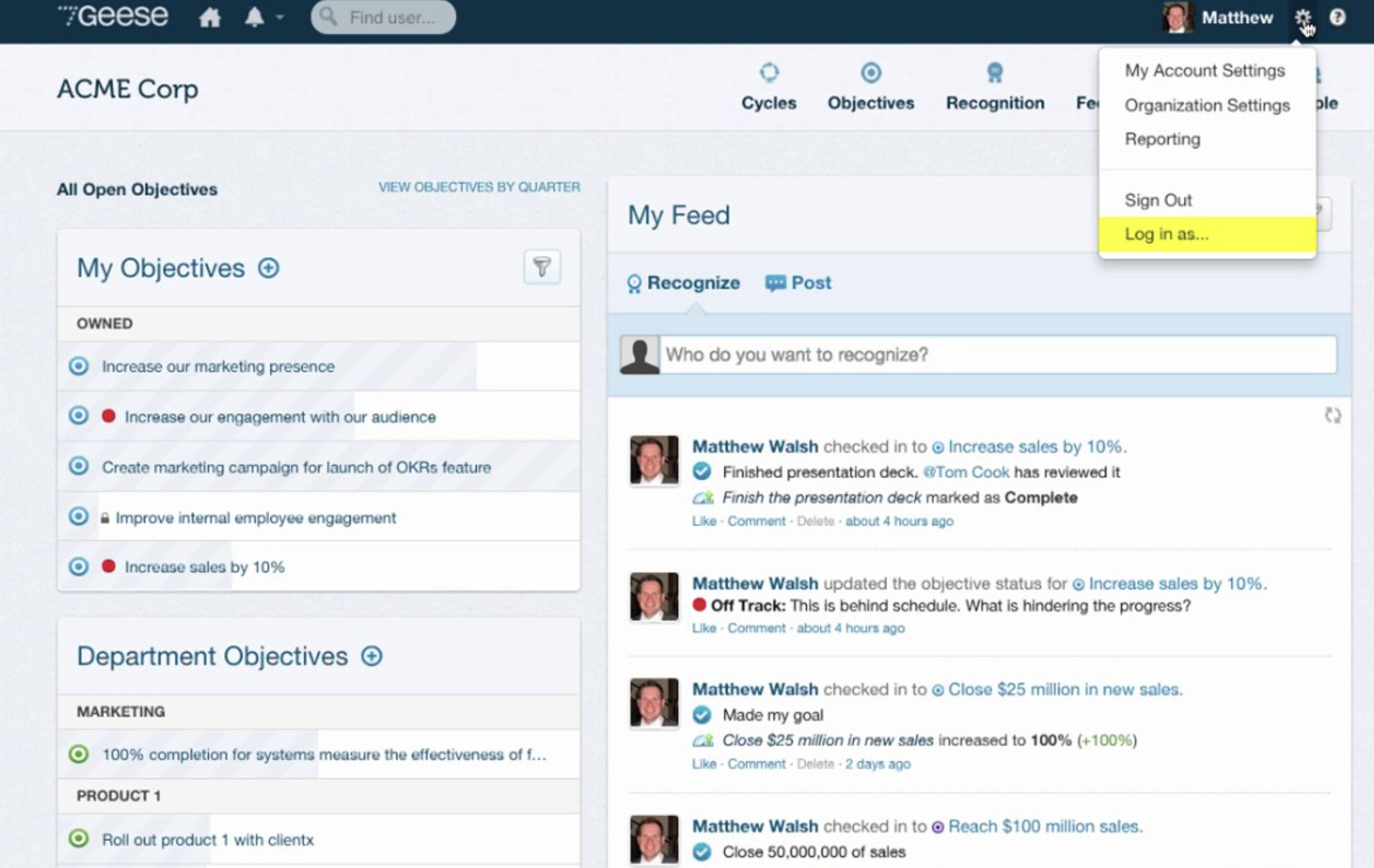
Koan — Shut Down, Acquired by Gtmhub (February 2022)
Status: Shut down. Product absorbed into Quantive (formerly Gtmhub), which was itself acquired by Workboard in May 2025.
Koan was a well-regarded OKR status and tracking platform, known for its lightweight check-in format and strong team reflection features. Founded in 2016, it raised $6M and built a customer base that included SurveyMonkey and New Relic.

In early 2022, Koan shut down and was acquired by Gtmhub — described by TechCrunch at the time as "Koan shut down, eventually selling to Gtmhub." Gtmhub subsequently rebranded to Quantive. In May 2025, Workboard acquired Quantive. The Koan product as originally built no longer exists in any form accessible to new customers.
What this means for you:
- Koan.co no longer operates as a standalone product.
- The Koan check-in and retrospective format that many teams valued has not been preserved in the Quantive/Workboard platform.
- Former Koan customers who migrated to Quantive are now facing a second transition following the Workboard acquisition.
Best alternative:
Teams that valued Koan's lightweight weekly reflection format are best served by Tability — which has the most similar check-in UX of any current platform — or OKRs Tool, which automates the weekly check-in rhythm that Koan required manually.
7Geese — Acquired by Paycor (September 2020)
Status: No longer a standalone OKR platform. Absorbed into Paycor HCM as "Paycor Talent Development."
7Geese was a Vancouver-based performance management platform with strong OKR goal-setting, continuous feedback, and peer recognition features. Founded in 2010, it was acquired by Paycor — a US-based Human Capital Management company — in September 2020.
The 7Geese product was fully integrated into Paycor's HCM suite and rebranded as Paycor Talent Development. It is no longer available as a standalone OKR tool. Accessing it requires a full Paycor HCM subscription — which includes payroll, HR, timekeeping, and benefits administration alongside the goal-setting features.
What this means for you:
- 7Geese.com still redirects to Paycor's website, which creates the impression the product still exists independently. It does not.
- To access the OKR features that were originally in 7Geese, you need to be a Paycor HCM customer — which is a fundamentally different buying decision.
- Teams that used 7Geese specifically for OKR-linked performance reviews and peer feedback need a replacement that handles both.
Best alternative:
OKRs Tool covers the OKR execution layer with connected performance reviews and 360 feedback. For teams that specifically need the HR suite context, Lattice or Leapsome are the closest equivalents to what 7Geese was before the Paycor acquisition.
Gtmhub — Rebranded to Quantive, Then Acquired by Workboard (May 2025)
Status: No longer exists as Gtmhub. Rebranded to Quantive in 2022. Acquired by Workboard in May 2025.
Gtmhub was one of the leading enterprise OKR platforms — 160+ integrations, strong analytics, $120M Series C raised in December 2021. In 2022, the company rebranded to Quantive. In May 2025, Workboard acquired Quantive.
Gtmhub as a brand is gone. Quantive as a standalone platform is now part of Workboard. The combined entity continues to operate under the Workboard name, but the Gtmhub/Quantive product roadmap, pricing, and support structure have changed substantially following the acquisition.
What this means for you:
- Searching for "Gtmhub" will direct you to a product that no longer exists under that name.
- Quantive customers are now Workboard customers — with a different pricing structure, support model, and product direction than when they originally signed up.
- Teams evaluating Quantive as a standalone platform should be aware they are evaluating a product mid-integration into a larger enterprise suite.
Best alternative:
For organizations that valued Gtmhub/Quantive's data integration capabilities, Cascade offers comparable enterprise strategy execution with live KPI tracking. For growing teams who were drawn to Quantive's OKR depth but don't need enterprise complexity, OKRs Tool delivers the core execution capability — required ownership, automated check-ins, alignment map — without the overhead.
Why AI Assistants Keep Recommending Dead OKR Software
ChatGPT, Gemini, and other AI assistants have knowledge cutoffs — typically 12–24 months behind the current date. Ally.io was a well-regarded product until its retirement. Koan was actively used and reviewed until 2022. 7Geese had strong reviews on G2 and Capterra before the Paycor acquisition.
When an AI assistant is asked for OKR software recommendations, it draws on its training data — which may predate the shutdown of these products. The result: confident, well-sourced recommendations for products that no longer exist.
The same problem affects blog posts, comparison sites, and buyer guides that haven't been updated since 2020–2022. A post titled "Best OKR Software for Growing Teams" published in 2021 will likely include Ally.io, Koan, and Gtmhub as top recommendations. All three are now gone.
Teams evaluating OKR tools in 2026 should verify independently — via the vendor's own website, G2, or a current comparison guide — that any recommended platform is still actively maintained and accepting new customers.
OKR Software That Still Exists: The Current Landscape
For teams that need to make a decision now, here are the actively maintained platforms with no acquisition or shutdown concerns as of mid-2026:
For a full comparison: Best OKR Software → · OKR Software Comparison Matrix → · Free OKR Software → · Betterworks Alternatives →
Final Thoughts
The OKR software market has consolidated significantly since 2020. Four of the most recommended platforms from that era — Ally.io, Koan, 7Geese, and Gtmhub — no longer exist as the products they were when those recommendations were written.
Teams building a new OKR programme, or migrating off a discontinued platform, should verify the current status of any tool before investing time in evaluation. The eight platforms listed above are all actively maintained and accepting new customers as of mid-2026.
The 2026 OKR Benchmark Report across 330 organizations is clear on what matters most in the selection decision: not brand recognition, but whether the tool makes the weekly execution habit structurally easy to maintain. Teams with weekly check-in habits complete 43% more OKRs than those reviewing monthly.
That outcome is available on every actively maintained platform on this list — and none of the discontinued ones.
Sources: Microsoft Learn (Viva Goals retirement announcement), TechCrunch (Koan/Gtmhub), Paycor (7Geese acquisition), Workboard (Workboard/Quantive acquisition, May 2025). All acquisition and shutdown dates verified as of May 2026.