Most OKR programmes don't fail at the planning stage. They fail in week four, when updates stop, visibility drops, and the goals set in January become invisible. A shared OKR dashboard fixes that — not by adding complexity, but by making progress impossible to ignore.
Three weeks into a cycle, most teams face the same problem. The objectives were written thoughtfully. The Key Results are measurable. And then the quarter starts, and progress updates scatter across docs, Slack threads, and a shared spreadsheet that three people bookmarked and nobody updates.
Nobody knows what's moving. Nobody knows what's blocked. And the weekly check-in — the habit that drives 43% more OKR completions — can't happen when nobody knows where to look.
An OKR dashboard solves the visibility problem structurally. It's not a reporting tool. It's the single place where OKR status is live, owned, and visible to everyone who needs to act on it.
What Is an OKR Dashboard?
An OKR dashboard is a centralized, live view of your team's Objectives and Key Results — including current progress, ownership, status updates, and alignment across teams and company priorities.
It replaces static spreadsheets, disconnected documents, and status updates delivered verbally in meetings with a shared, continuously updated workspace. The goal is simple: make it impossible for a goal to go invisible between the planning session and the end-of-cycle review.
A strong OKR dashboard surfaces three things that most organizations struggle to see mid-cycle: which goals are on track, which are drifting before they become misses, and whether each team's work is visibly connected to a company priority.
The OKR Intelligence Report 2026 found that 7% of off-track Key Results are simply abandoned mid-cycle — informally dropped with no revision or escalation. The dashboard is the structural fix that makes invisible goals visible before they get dropped.
What a Good OKR Dashboard Must Include
A dashboard that tracks everything is as useless as one that tracks nothing. The right elements are those that surface the signals leadership and teams need to act on — without adding data maintenance overhead that reduces adoption.
What the OKRs Tool Dashboard Looks Like in Practice
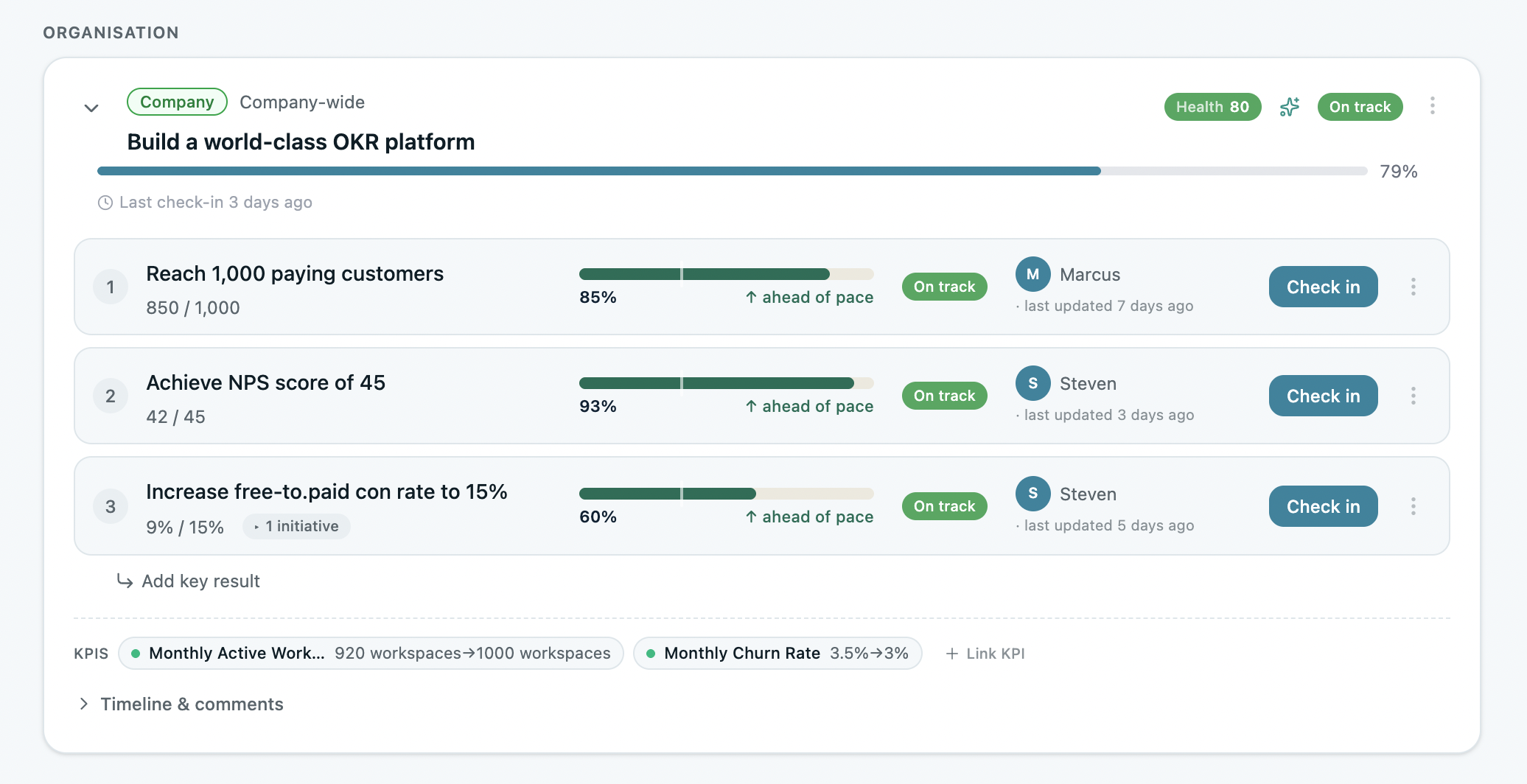
Show ImageOKRs Tool dashboard — Objectives, Key Results, named owners, live progress scores, and check-in status in one view. No status meeting required.
The dashboard inside OKRs Tool is built for the specific operational reality of growing teams at 50–200 people: OKR tracking, alignment map, weekly check-in history, and at-risk indicators all in one view.
The automated check-in nudge — via Slack or MS Teams — removes the manual step that most dashboard implementations break on. The check-in doesn't require someone to remember to look at the dashboard. The dashboard comes to them.

How to Use the Dashboard Across the Full Cycle
During planning. The dashboard should be populated before the cycle starts — not used as a place to retroactively log goals that were set elsewhere. Every Objective, every Key Result, every named owner, live in the dashboard before day one. The OKR Champion or team lead reviews for cascade completeness — every team KR connected to a company priority in one view. Teams that complete the cascade before the cycle starts see up to 50% higher completion rates.
During execution. The dashboard's value compounds with the weekly check-in habit. Named owners update Key Result progress in under five minutes — progress, blockers, and priority for the week. Leadership opens the dashboard and sees what's on track, what's drifting, and where to focus attention. No status meeting required. The 2026 OKR Benchmark Report found teams with automated weekly check-ins complete 43% more OKRs than those reviewing monthly. The dashboard only generates that return if the check-in is running.
During the mid-cycle review. At week six, the dashboard becomes the source of truth for the mid-cycle conversation. Every Key Result is scored honestly. Anything below 0.5 gets an explicit decision — revise the target, escalate the blocker, or formally close it. The dashboard makes that conversation take twenty minutes rather than two hours of data compilation.
During the end-of-cycle review. OKR reflection is more valuable and less painful when progress has been tracked all quarter. The dashboard surfaces scores, check-in frequency, at-risk history, and missed goals — giving the retrospective real data rather than recollection. Teams that run structured end-of-cycle retrospectives complete 30–45% more OKRs the following cycle.
Dashboard vs Spreadsheet
The instinct is to start with a spreadsheet. It's free, familiar, and fast to set up. For a 5-person team in a first cycle, it works.
The problem appears in week four. No automated check-in nudge. No at-risk flagging. No live alignment map. Updating the spreadsheet requires remembering to open it — and when the quarter gets busy, that memory is the first thing to go.
The ROI data across 330 organizations is precise: organizations using purpose-built OKR software with a dashboard built around execution habits generate a 1:88 return on investment — compared to 1:25 on spreadsheets. The gap isn't the software cost. It's the weekly visibility that a purpose-built dashboard makes structurally unavoidable.
Start with the free OKR template in Excel or Google Sheets if you're evaluating the framework. Move to a purpose-built platform before the habit breaks — typically around cycle two or three.
Final Thoughts
The dashboard isn't the most exciting part of running OKRs. It's not where strategy happens or where ambition gets set. But it's where both go to live or die.
An OKR programme without a shared dashboard is a planning exercise. An OKR programme with one is a management system — one that makes progress visible, ownership clear, and misalignment catchable before it becomes a missed quarter.
Data: The ROI of OKRs: 2026 Benchmark Report (330 respondents), The 2026 OKR Benchmark Report (200+ organizations), OKR Intelligence Report 2026 (222 organizations).