Most performance management dashboards measure how people operate — competencies, behaviors, feedback scores. Very few measure what people actually delivered. This guide covers what a high-performing performance management dashboard contains, why the missing layer is OKR delivery data, and what the benchmark evidence shows about the connection between goal execution and performance.
______________________________________________________________________________________________________
Most performance management dashboards have the same blind spot.
They show you how someone operates — communication scores, collaboration ratings, leadership competency. They show you what peers think. They show you manager ratings and self-assessments.
What they don't show you: whether the person actually moved the metrics that matter.
A 4.2 on "execution and delivery" from a peer review is one signal. A 25% completion rate on the Key Result "Generate $10,000 from inbound leads" is a different — and more concrete — signal. The best performance management dashboard shows both, side by side, in the same view.
Our 2026 OKR Benchmark Report across 330 organizations found that only 5% of teams have more than 75% of their weekly work tied to a goal. 65% of teams admit their goals aren't linked to company strategy. When performance management systems don't include OKR delivery data, those gaps stay invisible — and performance conversations are based on behavioral impressions rather than outcome evidence.
This guide covers what a high-performing performance management dashboard actually contains, why outcome data is the missing layer in most systems, and how to structure reviews that connect what people delivered to how they operated.
Download the Free Performance Review Template →
Why Most Performance Management Dashboards Fall Short
Performance management dashboards typically fail in one of two ways:
They measure activity, not outcomes. Competency ratings, feedback scores, and participation metrics tell you how someone behaves at work. They don't tell you whether that behavior produced the results the organization needed. A highly collaborative employee who missed every Key Result is a different kind of problem than an abrasive one who hit them all.
They're disconnected from the goal system. In most organizations, OKRs or goal-tracking live in one tool and performance reviews live in another. By the time a manager sits down to review someone, they're working from memory rather than data — approximating OKR delivery rather than referencing it directly.
The benchmark data makes the cost concrete: only 49% of leaders consistently review goals on a weekly basis. If OKR delivery data isn't surfaced automatically in the performance review, most managers simply won't have it — and the review becomes a behavioral impression rather than an evidence-based conversation.
What a High-Performing Performance Management Dashboard Contains
Based on what we've built in OKRs Tool and the patterns from 330 organizations, a performance management dashboard that drives better decisions contains five layers:
1. OKR Delivery Score
The foundation. Before any behavioral assessment, the dashboard should show what the person actually delivered against their goals this cycle.
Not a subjective manager estimate of "how they did on their goals" — a data-driven score based on actual Key Result completion rates across the cycle.
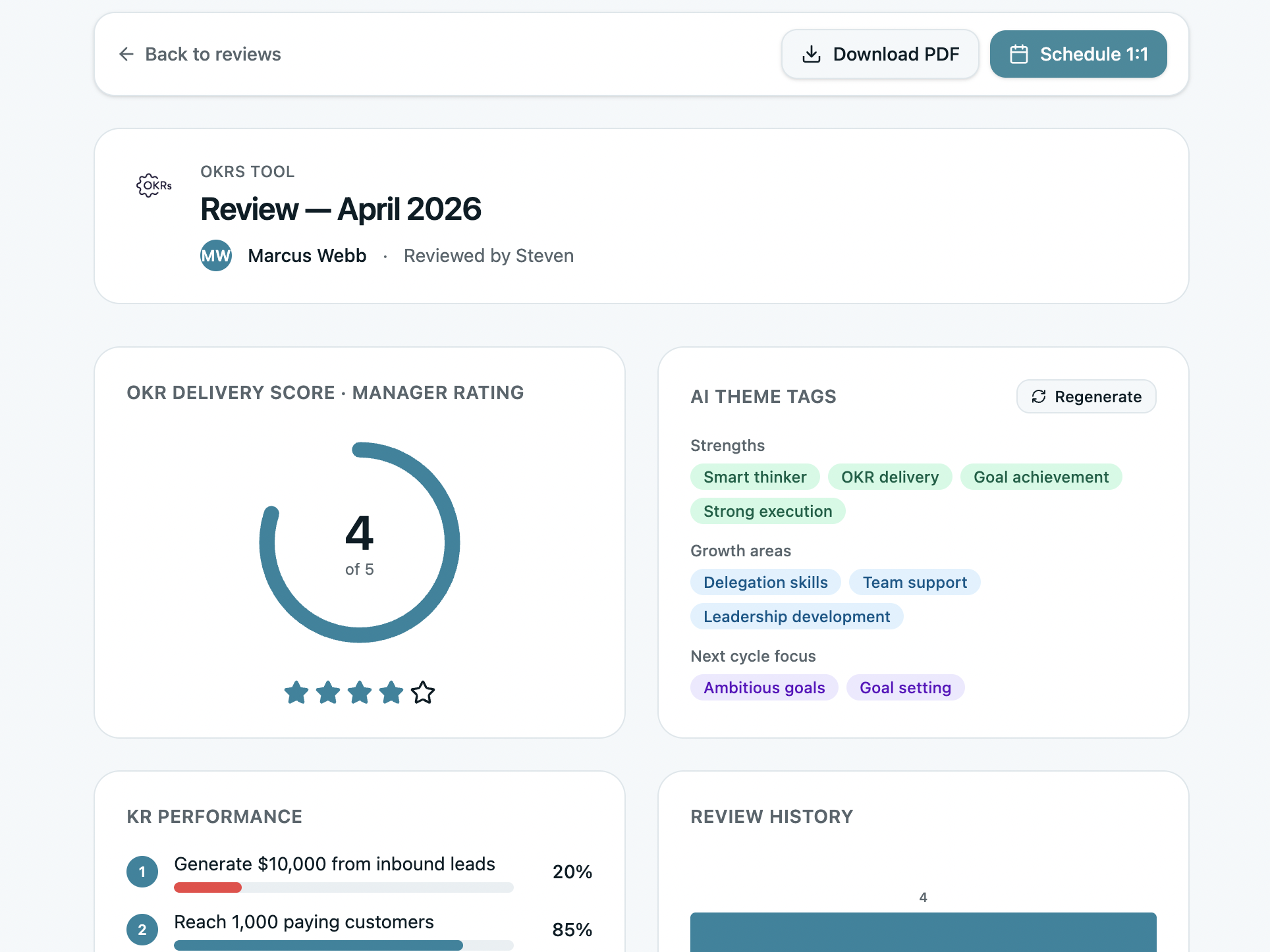
This breakdown matters because aggregate scores hide the story. A 4/5 delivery score with 100%, 25%, 93%, 36% across four KRs tells a different story than a uniform 64%. One KR was hit completely. One was barely started. The pattern — which KRs moved and which didn't — is the actual performance signal.
2. Competency Scores — Self, Manager, and Peer
Behavioral evidence from multiple perspectives: how the person assesses themselves, how their manager sees them, and what peers observe.
The multi-source view matters because single-source ratings systematically miss certain failure modes. Managers often don't see how someone operates in peer collaboration. Peers often don't see how someone takes direction from leadership. Self-assessments reveal calibration — whether the person has accurate insight into their own performance or a significant blind spot.
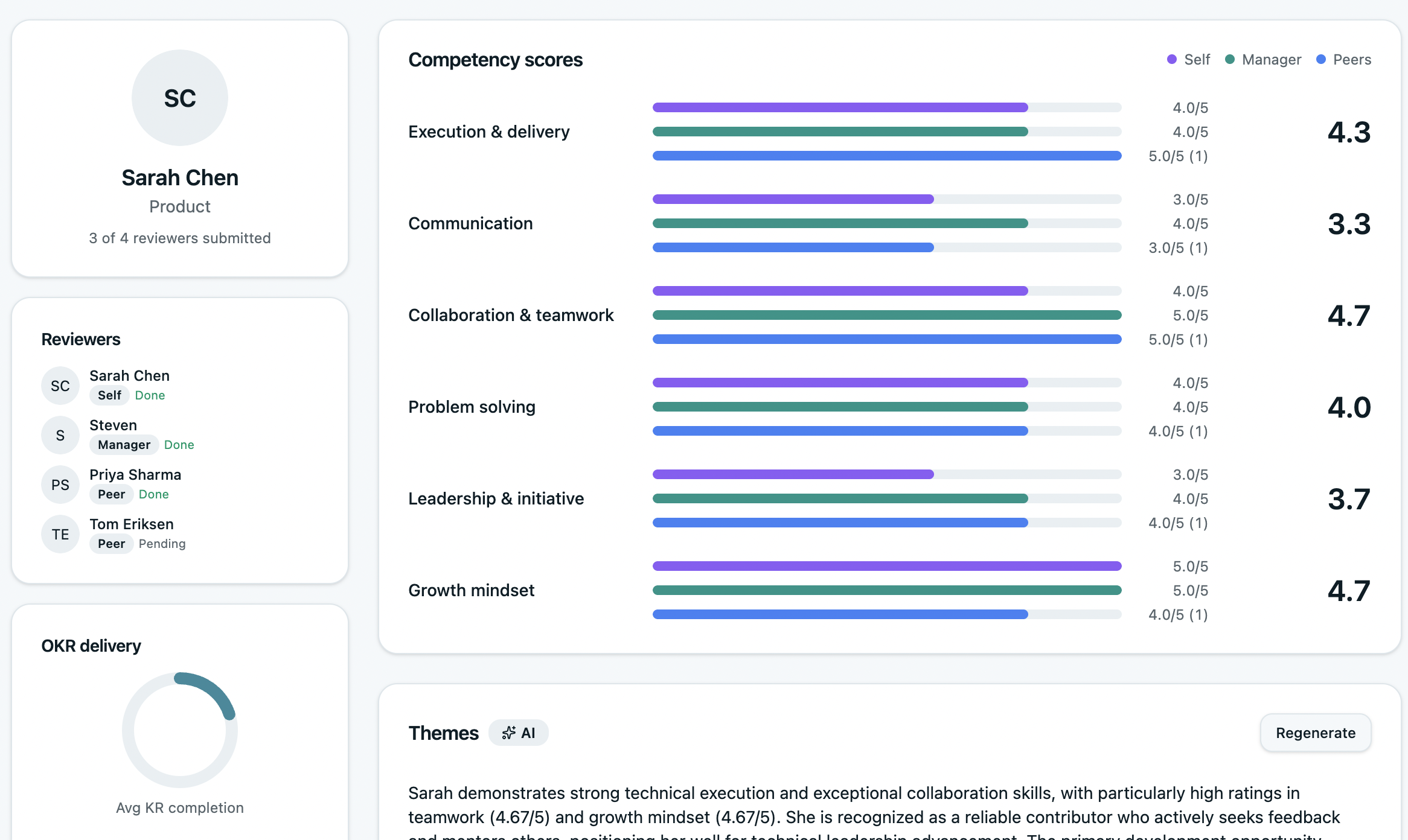
The competency scores alongside the OKR delivery sidebar on the left is the key design decision. The manager reviewing Sarah can see her KR completion rates at the same moment as her competency scores — making the connection between how she operates and what she delivers visible without switching views.
3. AI-Generated Themes — Strengths, Growth Areas, Next Cycle Focus
Synthesizing feedback from multiple reviewers into coherent themes is time-consuming and prone to recency bias when done manually. AI-generated themes surface patterns that individual managers might miss.
The OKRs Tool review generates three sets of AI tags: Strengths (what reviewers consistently praise), Growth areas (where feedback signals development needs), and Next cycle focus (what the person should prioritize in the next OKR cycle).
In Marcus' case, the screenshot produces a precise and useful performance read:
"Marcus demonstrates exceptional problem-solving capabilities and is highly valued as a collaborative team member. However, he struggles with work-in-progress discipline, taking on too many parallel initiatives."
That specific insight — the gap between strong delivery on some KRs (KR3 at 100%, "Reach 1,000 paying customers" at 93%) and weak delivery on others (25%, 36%) — becomes explainable. It's not a motivation problem. It's a scope management problem. The AI theme connects the behavioral feedback to the outcome data in a way that makes the review conversation more specific and more useful.
4. Review History and Trend
A single review is a snapshot. A trend is a pattern.
The review history view shows how an employee's delivery score and competency ratings have changed across cycles — making it possible to distinguish a temporary dip from a sustained performance issue, and a recent improvement from a long-term trend.
This is particularly valuable for promotion and compensation decisions, where a single high-scoring review can be misleading if it's an outlier against a lower baseline.
5. Reviewer Completion Status
Practical but important: which reviewers have submitted, which are pending, and whether the review has enough data to be meaningful.
A 360 with two out of five reviewers submitted is incomplete. A dashboard that shows this clearly — as the OKRs Tool view does (4 of 5 reviewers submitted, Sarah Chen pending) — prevents managers from drawing conclusions from insufficient data.
The Connection Between OKR Delivery and Performance Review
The most important design decision in a performance management dashboard isn't the rating scale or the competency framework. It's whether the goal system and the review system are connected.
When they're separate:
- Managers approximate OKR delivery rather than referencing it
- Performance conversations are behavioral impressions, not outcome evidence
- High performers who had a bad quarter look the same as low performers who had a good one
- Development conversations can't distinguish capability gaps from execution environment gaps
When they're connected:
- OKR completion rates appear automatically in the review — no manual compilation
- The weekly check-in habit feeds directly into the review data — managers who review weekly have richer evidence
- Development areas are grounded in specific KR patterns, not general impressions
- The retrospective question "what should we do differently next cycle?" has a data answer, not a gut-feel one
The benchmark evidence on what this connection produces: teams with clear single ownership on every Key Result — the structural condition that makes individual OKR delivery trackable — see 26% higher completion rates. When that ownership data feeds into performance reviews, accountability becomes visible and consistent rather than selective and memory-dependent.
What Good Looks Like: The Performance Management Dashboard Checklist
The Performance Review Template
The free template below mirrors the five-layer structure above — giving managers a structured, data-driven review format that works even without dedicated software.
What's inside:
Download the Free Performance Review Template →
When to Move to Dedicated Software
The template works well for teams running their first performance review cycles or organizations under 20 people. Beyond that, three limitations become friction:
No automatic OKR delivery data. The template requires the manager to manually compile KR completion rates before the review. In a weekly check-in system, that data already exists — it just needs to surface in the right place at the right time.
No trend visibility. A single spreadsheet review doesn't show how performance has changed across cycles. Identifying whether a gap is a development priority or a temporary circumstance requires historical context.
No reviewer coordination. Managing who has submitted, sending reminders, and aggregating multi-source scores manually is time-consuming and error-prone at scale.
OKRs Tool connects OKR delivery directly to performance reviews — KR completion rates populate automatically, 360 feedback is collected in the tool, AI synthesizes themes from reviewer input, and review history is tracked across cycles. The dashboard in the screenshots above is what your managers see when the goal system and the review system share the same data.
Final Thoughts
A performance management dashboard that shows behaviors without outcomes is half a picture.
The organizations generating the highest returns from their people programs — and from OKRs specifically — are the ones that have made outcome data a first-class input into performance conversations.
OKR delivery scores alongside competency ratings. KR completion breakdowns alongside peer feedback. Historical trends alongside current ratings.
That connection — what someone delivered plus how they delivered it — is what makes performance conversations specific, fair, and useful for development rather than just evaluative.
The template gives you the structure. The checklist gives you the signals to watch for. And when the team is ready for the system to do the heavy lifting, OKRs Tool connects both layers automatically.