
Most OKR dashboards show too much — or the wrong things. This guide covers what a high-performing OKR dashboard actually contains, based on data from 330 organizations, with a free template you can use today.
_______________________________________________________________________________________________________
Most OKR dashboards have the same problem: they're built to display goals, not to drive decisions.
They show a list of objectives. They show progress bars. They show who owns what. And then leadership looks at it once a quarter — if at all.
The benchmark data puts a number on this: only 49% of leaders consistently review OKRs on a weekly basis. The remaining 51% do so sometimes, rarely, or never. And only 5% of teams have more than 75% of their weekly work tied to a goal.
The gap between those two numbers — a leadership team that isn't reviewing weekly and a team whose work isn't connected to goals — is where most OKR ROI gets lost. The 1:25 return is there. The dashboard is the infrastructure that makes it visible.
This guide shows what a high-performing OKR dashboard actually contains, why most templates show the wrong things, and how to build one that drives weekly decisions rather than quarterly reporting.
Download the Free OKR Dashboard Template →
Why Most OKR Dashboards Fail
A dashboard that nobody opens isn't a dashboard — it's a document.
The reason most OKR dashboards don't drive behavior comes down to three structural problems:
1. They're built for reporting, not decisions.Most dashboards answer "what happened?" They don't answer "what needs to change?" A dashboard built for reporting shows completion percentages. A dashboard built for decisions surfaces what's at risk before it becomes a miss.
2. They require manual preparation.When the data that feeds a dashboard has to be assembled before the meeting, the dashboard becomes a presentation artifact rather than a live signal. By the time it's ready, the insights are already stale. The benchmark sweet spot: leaders who walk into the weekly check-in with status already visible — no prep required.
3. They show too much.A dashboard with 15 objectives across 6 teams, each with 4 Key Results, produces 90+ data points. Nobody reads 90 data points in a 20-minute check-in. High-performing dashboards answer three questions and nothing else:
- What's on track?
- What's at risk?
- What needs a decision right now?

What a High-Performing OKR Dashboard Actually Shows
From the benchmark data, here's what consistently appears in the dashboards of teams generating the highest OKR returns:
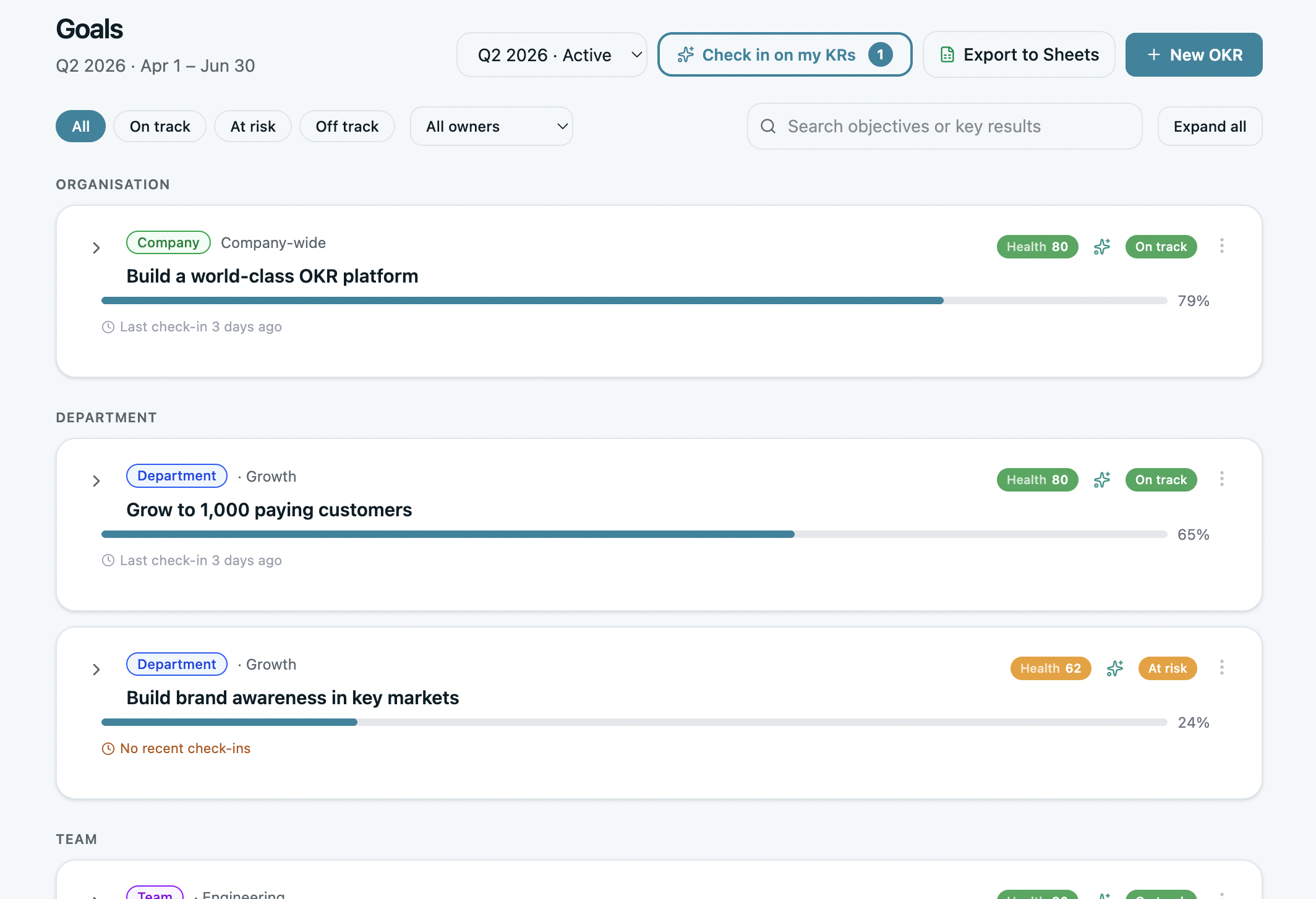
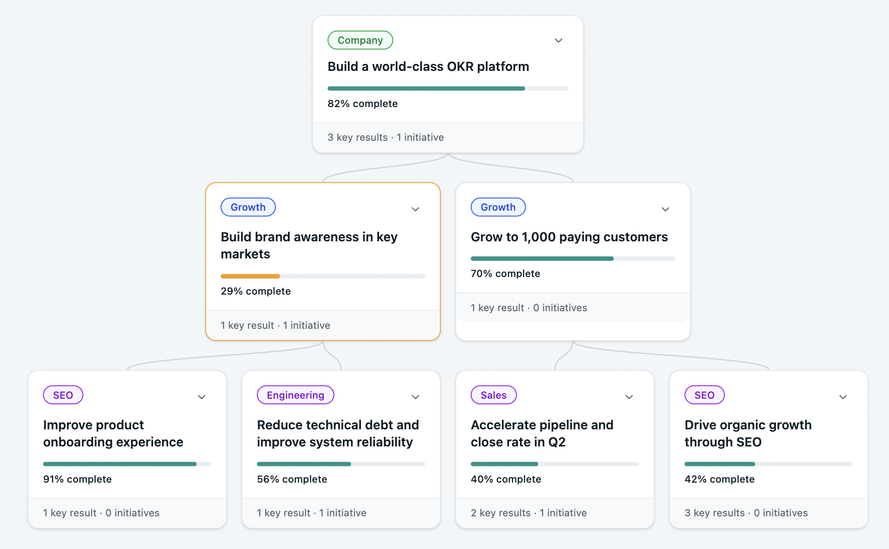
1. Company-Level OKR Status — At a Glance
The first thing any leader should see: the 2–3 company objectives for the quarter, each with a traffic light status and a current progress figure.
Nothing more. If a company objective is on track, one glance should confirm it. If it's at risk, the dashboard should flag it without anyone having to dig.
2. Key Result Progress With Ownership
Each objective breaks down into 2–3 Key Results, each with a named owner, a baseline-to-target figure, current progress, and status.
The named owner is non-negotiable. 50% of all Key Results across growing organizations have no named owner — and teams with clear single ownership see 26% higher completion rates. The dashboard enforces this by making ownership visible at all times.
3. At-Risk Flags — Not Just Status
The most valuable dashboard signal isn't "what's the completion percentage?" — it's "what needs intervention before it's too late?"
An at-risk KR with four weeks left is recoverable. An off-track KR discovered at the quarter-end review isn't. High-performing dashboards surface at-risk signals automatically — based on progress velocity, update frequency, and distance from target — rather than waiting for someone to notice.

4. Check-In Cadence Indicator
One of the clearest signals of an OKR program in trouble: Key Results that haven't been updated in two weeks.
A high-performing dashboard shows the last-updated date on every KR — making it immediately visible when the weekly habit has slipped. Teams that maintain a weekly check-in ritual complete 43% more OKRs than those reviewing monthly or ad hoc. The dashboard is what makes that habit visible and accountable.
5. Team-Level Roll-Up
For leaders managing multiple teams, the dashboard should show a one-line summary per team: overall status, number of OKRs on track vs at risk, and any blockers flagged.
This is the view that replaces the "how's everything going?" meeting. The alignment map in OKRs Tool does exactly this — showing how every team's goals connect to company priorities in a single view.
The Free OKR Dashboard Template
The template below gives you everything in one place — company OKRs, team Key Results, ownership, status, and a weekly update field.
It's designed for teams using a spreadsheet or lightweight tool, and structured so the most important information is always visible at the top.
What's inside:
Download the Free OKR Dashboard Template →
How to Use the Dashboard Week by Week
The template is only as useful as the rhythm around it. Here's the weekly workflow that makes it a decision-making tool rather than a reporting document:
Monday — KR owners update status. Each Key Result owner spends 2–3 minutes updating their progress figure, changing the status indicator if needed, and adding one line of context in the notes field. Total time per person: under 5 minutes.
Monday or Tuesday — Leadership reviews the dashboard. Before the weekly check-in, leadership scans the company dashboard view. The goal: identify any red or yellow flags before the meeting starts. The meeting time goes toward decisions, not data collection.
Weekly check-in — 20 minutes. The check-in agenda follows directly from the dashboard: what's green (note it, move on), what's yellow (what changed, what's the response), what's red (what's the decision). Twenty minutes. Same time every week.
End of cycle — complete the Cycle Summary tab. Score each Key Result (0–1.0), note what moved and what didn't, and carry insights forward into the next cycle's planning session. Teams that run consistent end-of-cycle reviews complete 30–45% more OKRs the following quarter.
Dashboard Signals That Predict Performance

From the benchmark data, four dashboard signals consistently predict whether an OKR program is generating returns or losing them:
If your dashboard can surface all four signals in under 60 seconds, it's doing its job. If it takes longer than that, simplify it.
When to Move From Template to Software
The template works well for teams under 20 people running their first 1–2 OKR cycles. Beyond that, the limitations become friction:
- No automated reminders when KRs go stale
- No at-risk flagging without manual review
- No alignment visualization across teams
- No AI-assisted recovery suggestions
- Version control issues as teams grow
The benchmark data on this is clear: organizations using purpose-built OKR software generate a 1:88 return compared to 1:25 on spreadsheets. The gap isn't the software cost — it's the weekly habit that purpose-built tools make structurally easier to maintain.
When the template starts requiring more effort to maintain than it saves, that's the signal. Most teams feel it somewhere between 15–25 people.
Final Thoughts
An OKR dashboard isn't a report. It's a decision-making tool — and it's only valuable if it changes behavior.
The benchmark data is unambiguous: leaders who review OKRs weekly drive significantly better outcomes than those who don't. The dashboard is the infrastructure that makes weekly review fast enough to actually happen. Five seconds to see what's green. Ten seconds to identify what's at risk. Twenty minutes to make the decisions that keep the quarter on track.
Build the simplest dashboard your team will actually open every week. Start with the template. Upgrade when it stops being enough.